Typography
The Van der Plas primary typeface is FK Grotesk VDP. Known for its distinct modernity and clean aesthetic. With its sleek lines, sharp edges, and refined letterforms, FK Grotesk VDP conveys a sense of contemporary sophistication. Its precise and balanced design ensures legibility, making it an ideal choice for conveying Van der Plas’s message with clarity and style. Its character allows it to stand out in large and smaller sizes, while its details reference the forms of the logo.
Primary typeface
FK Grotesk VDP Regular

FK Grotesk VDP Medium

Office typeface
Arial as our office typeface for its widespread availability, compatibility, and familiarity. Arial is a widely supported and commonly used font across various platforms and applications, making it a practical choice for ensuring consistent typography in office documents.
Arial Regular

Arial Bold

Typography in use
FK Grotesk VDP Regular is chosen for body text and headings due to its excellent legibility. Its clean and modern design ensures easy readability. For subheadings and introduction, we use FK Grotesk VDP medium to create a bold and attention-grabbing impact.
This combination creates a cohesive and clear typographic system for our brand.
The overview below shows the selected styles of FK Grotesk VDP Regular and FK Grotesk VDP Medium for typographic elements such as headings, subheadings, intros, and body copy. These examples can be used as a starting point for developing new communication items.
Please note: for large headings, a letterspacing of -25 is used.
The ideal partner for any florist
FK Grotesk VDP Regular Headings
Subheadings example
The most beautiful traffic jam in the world
FK Grotesk VDP Medium SubHeadings
Think colour, splendour and hand-decorated floral floats: more than 1000 volunteers, 1.5 million flowers, 16 floats and no fewer than 950,000 spectators. Van der Plas is located a stone’s throw from the starting point of the Flower Parade in the Bulb Region and passed by. Read on and view the photos of the phenomenal creations.
FK Grotesk VDP Medium Introduction
More than 1,000 volunteers will roll up their sleeves in the coming days. They decorate the floats with mainly hyacinths, daffodils and tulips. The atmosphere is relaxed. The heroes of the parade have just started their work. The welders and painters have preceded them. The contours of the cars are already clearly visible. Arrangers of the parade also choose flowers from our Flourishing Partners Dutch Lily Masters, Polder Pride and Summit Gerbera. Only the best quality flowers are used.
In addition to the volunteers who take care of the ‘sticking’, we also see ‘arrangers’. These heroes are also here voluntarily. The arrangers are the artists of the parade. They get to work with the concept of the parade float and think about which (bulb) flowers they can use. The arrangers choose different techniques. Some frolic with oasis and chicken wire, while another works with iron fences and flower bottles with water.
FK Grotesk VDP Regular Bodytext
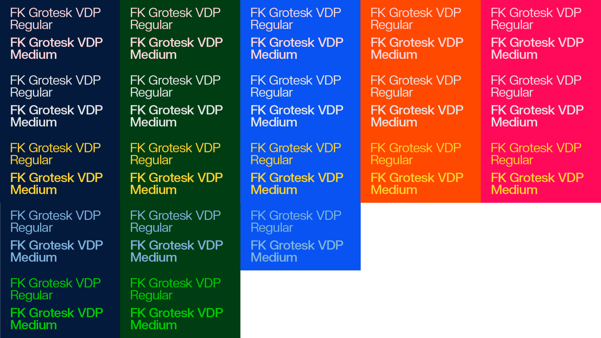
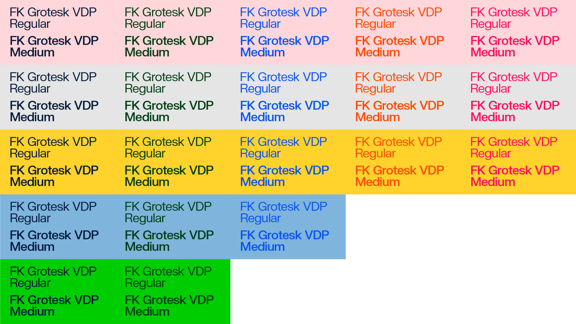
Typography with color
This overview shows all the possible color combinations for typographic elements and background colors. It is not allowed to add new color combinations.


