Logo
The logo for Van der Plas represents being ‘Born ready’, high quality with a personal touch, and the connections between people & flowers. The design concept is conveyed through a bold, simple, and colorful graphic identity.
All logo sets can be downloaded at the end of the logo chapter.
Logo
Full logo
Logo mark + wordmark
The full logo should be used during formal occasions, such as partnership logos, to ensure clear brand representation and utilize the full logo in contexts where clarity and recognition are paramount.
Bounding box
The logo has a predetermined bounding box. The bounding box is a free zone around the logo. This free zone is placed to protect the identity and integrity of the logo and should be respected in all situations. No other graphics can be placed in this free zone.
The bounding box is included in the logo set, and the x-height of the word mark determines its size.

Logo variations
Logo mark
The logo mark is the primary logo that can be used on all kinds of communication levels.
The logo features an outspoken pathway that symbolizes the efficient logistics involved in flower transportation. This signifies the connection between people and the joy of flower delivery. It is a simple, outspoken shape that effectively communicate
Van der Plas’ values.
Wordmark
The wordmark is modified based on the font FK Grotesk VDP black. It is easily readable and instantly recognizable, allowing for clear and consistent communication.
It should be used when the legibility and recognition of the full brand name are needed, it can work individually or together with the logo mark.
Dynamic logo
The logo plays an important role in the brand identity. It defines – with its use – how and where content is placed. Especially in motion where it can move and open up to reveal content and typography.
The ‘V’ and ‘d’ should always stay connected, the ‘P’ is the only element that can be disconnected from the logo.
More examples can check in Layout system section .
Logo with color
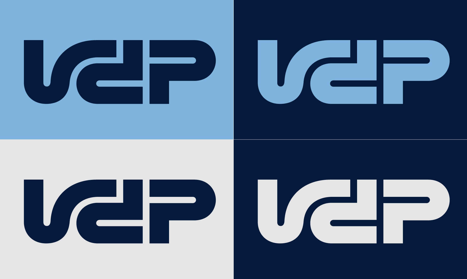
Primary color combinations
The logo is available in a large range of colors. The primary color combinations for the logo are shown below. These colors are representing the core of the Van der Plas brand with its heritage found in the iconic trucks (Metallic Blue) and the darker blue tone of the previous logo (Marine Blue).
For secondary color combinations see the chapter Color.
Avatar
We created a custom file for avatars. Within this file, the logo is optically aligned in the middle, rather than the ‘perfect’ middle. Always use the attached avatar. The preferred color of the logo is using Metallic Blue and Marine Blue for the logo mark and background.
Don'ts
Do not alter the logo in any way. Please do not rotate, skew, or distort the elements, apply effects, or add extra typography to the logo. Never attempt to (re)create the logo yourself, change the font, or alter the size or proportions. And always make sure the contrast between the background and logo is sufficient.
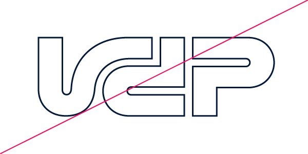 Outline
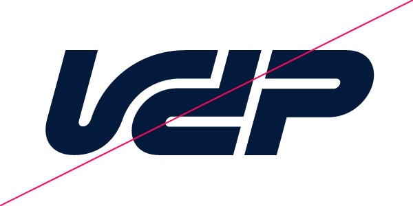 Skew
Skew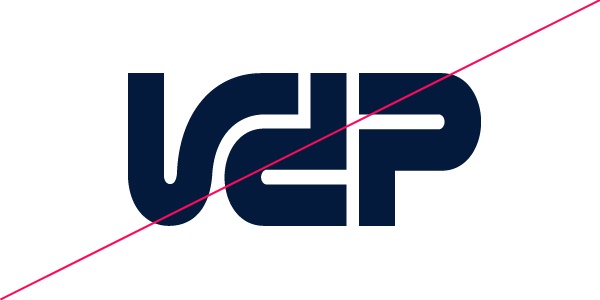 Scale unproportionally
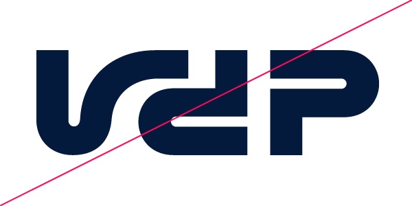 Separate
 Shadow
 Solid & Outline
 Gradient
 Multiple colors
