Color
This chapter showcases a carefully curated selection of colors that represent the Van der Plas identity. From the primary palette to the secondary hues, each color has been thoughtfully chosen to embody our brand’s values, evoke energy, and create a strong visual presence. Together, these colors form a cohesive and captivating palette that distinguishes Van der Plas.
Primary colors
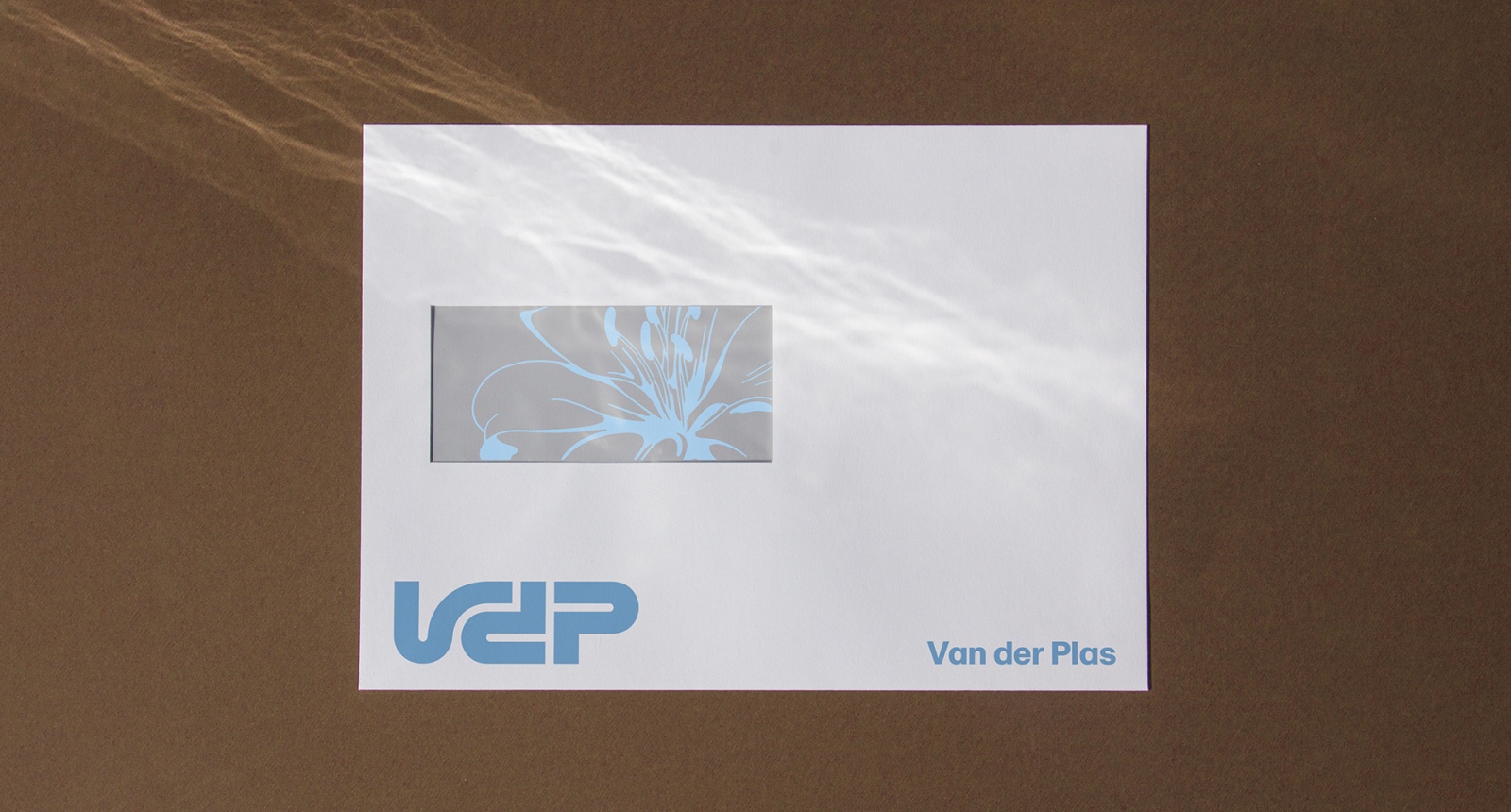
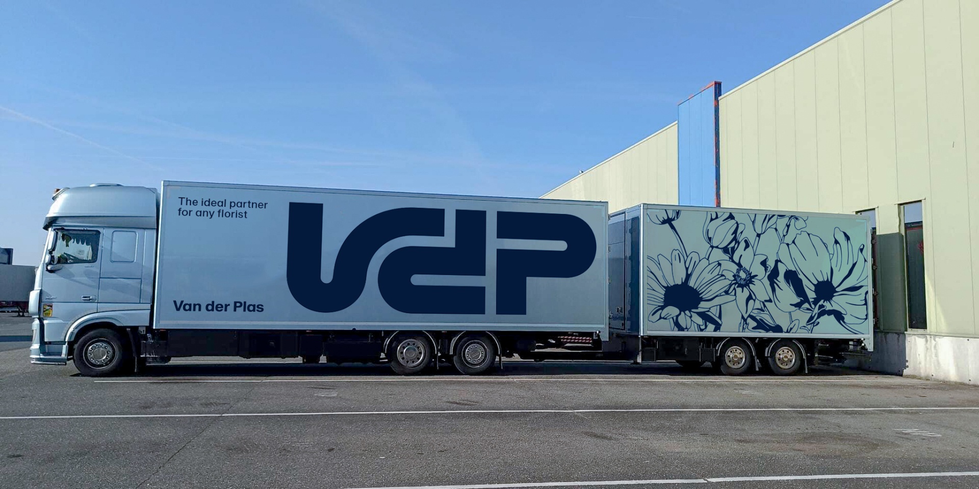
Metallic Blue and Marine Blue function as the primary colors of the brand. These colors represent the core of the Van der Plas brand with its heritage found in the iconic trucks (Metallic Blue) and the darker blue tone of the previous logo (Marine Blue)..
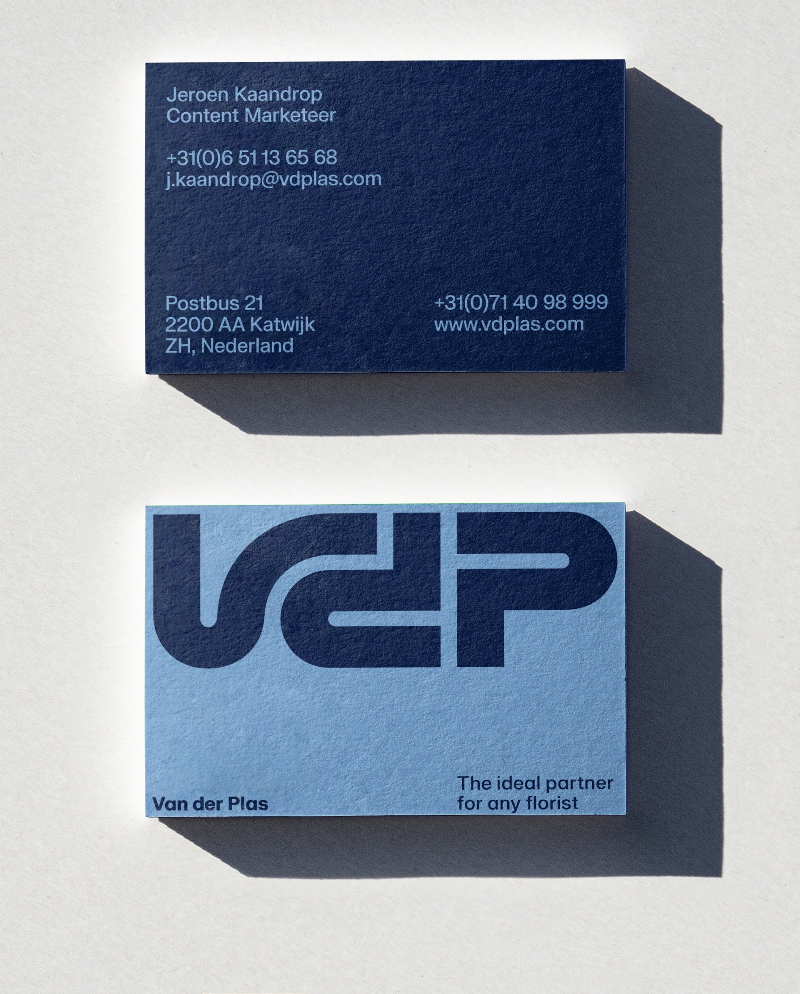
These colors represent the core of Van der Plas and are used for primary touchpoints like stationary and trucks.
Metallic Blue
CMYK:50 15 0 0
RGB:127 180 221
HEX:#7fb4dd
Marine Blue
Pantone:5255C/2767U
CMYK:100 90 20 40
RGB:4 26 60
HEX:#041a3c
Primary color combinations
Our brand book showcases a collection of color combinations that strike a balance between harmony and contrast. These carefully curated palettes offer a harmonious blend of hues for a cohesive and consistent visual identity, while also incorporating contrasting elements that add depth and visual interest.

Usage examples
Secondary colors
Secondary colors bring vibrancy and versatility, expanding our visual identity. They complement our primary palette, enabling captivating designs while maintaining brand consistency.
The use of the secondary palette has a huge range and keeps the brand feeling fresh and nonrepetitive. Examples of use are social media, campaigns, and employer branding.
Dahlia Pink
Pantone:670C/7436U
CMYK:0 20 5 0
RGB:255 214 218
HEX:#ffd6da
Sunflower Yellow
Pantone:121C/113U
CMYK:0 5 90 0
RGB:255 210 44
HEX:ffd22c
Grass Green
Pantone:2271C/7488U
CMYK:73 0 100 0
RGB:0 205 0
HEX:#00cd00
Soft Gray
Pantone:Cool Gray2C/Cool
CMYK:0 0 0 15
RGB:229 229 229
HEX:c#e5e5e5
Rose Magenta
Pantone:2039C/2039U
CMYK:0 100 50 0
RGB:255 10 90
HEX:#ff0a5a
Pioen Orange
Pantone:2028C/2028U
CMYK:0 85 100 0
RGB:255 72 0
HEX:#ff4800
Forest Green
Pantone:3537C/3435U
CMYK:86 44 94 55
RGB:0 61 19
HEX:#003d13
Royal Blue
Pantone:2132C / 286U
CMYK:100 57 0 0
RGB:8 83 241
HEX:#0853f1
Secondary color combinations
Our brand book showcases a collection of color combinations that strike a balance between harmony and contrast. These carefully curated palettes offer a harmonious blend of hues for a cohesive and consistent visual identity, while also incorporating contrasting elements that add depth and visual interest.
Dark colors on light backgrounds
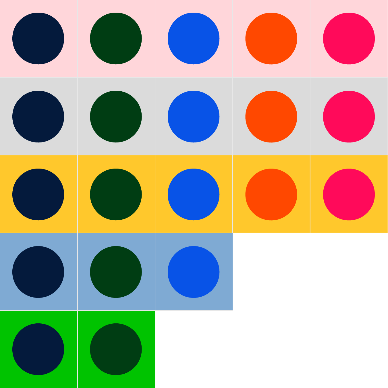
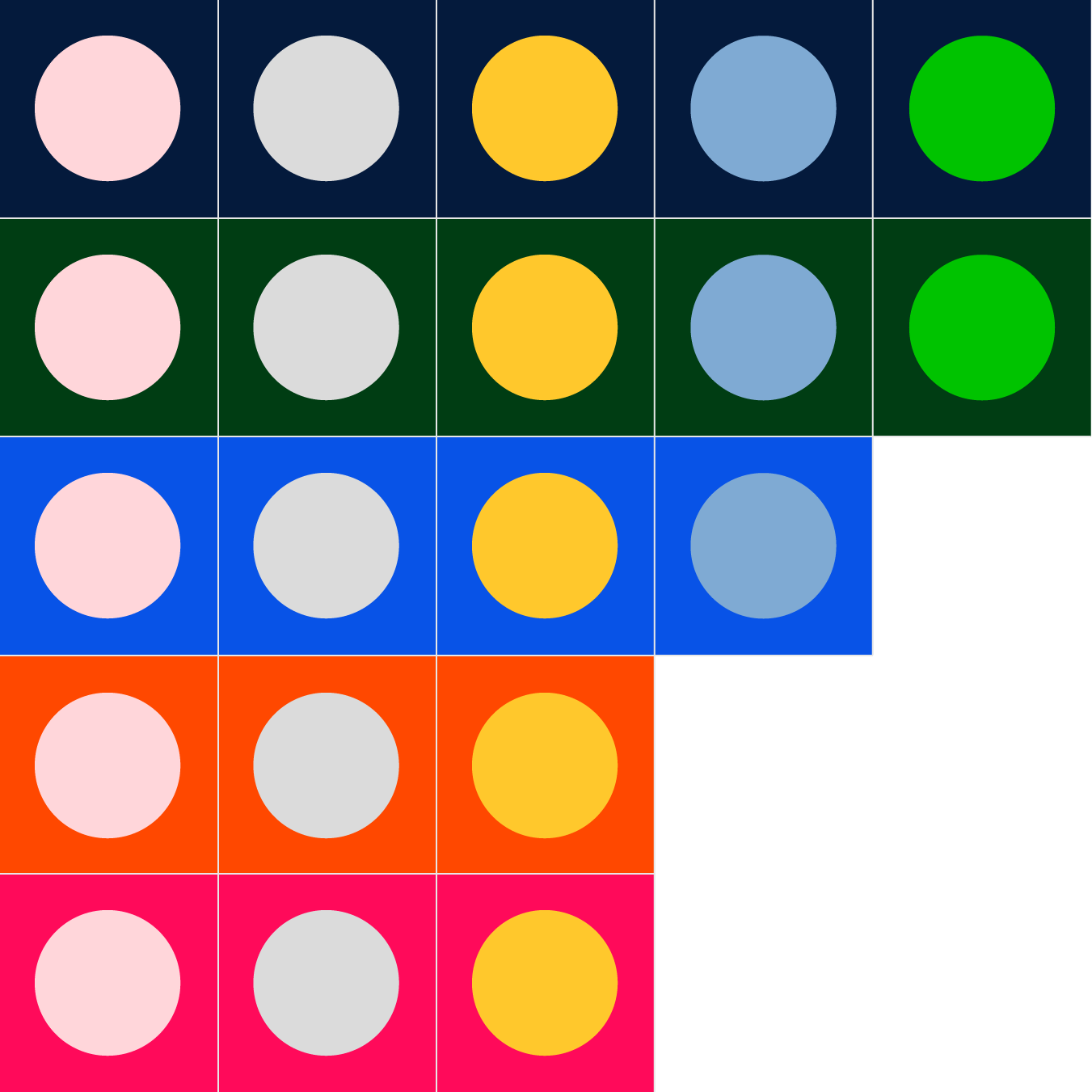
Light colors on dark backgrounds
Usage examples
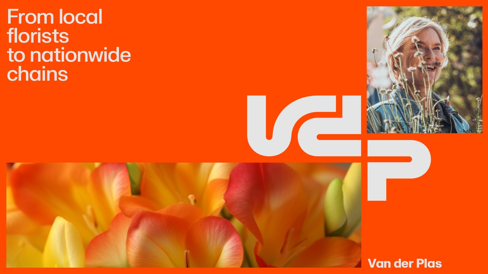
Harmony
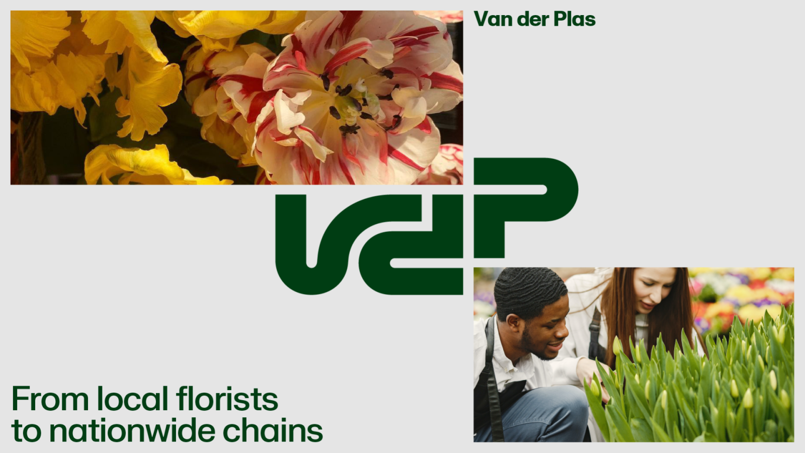
Contrast
How to select the right combinations
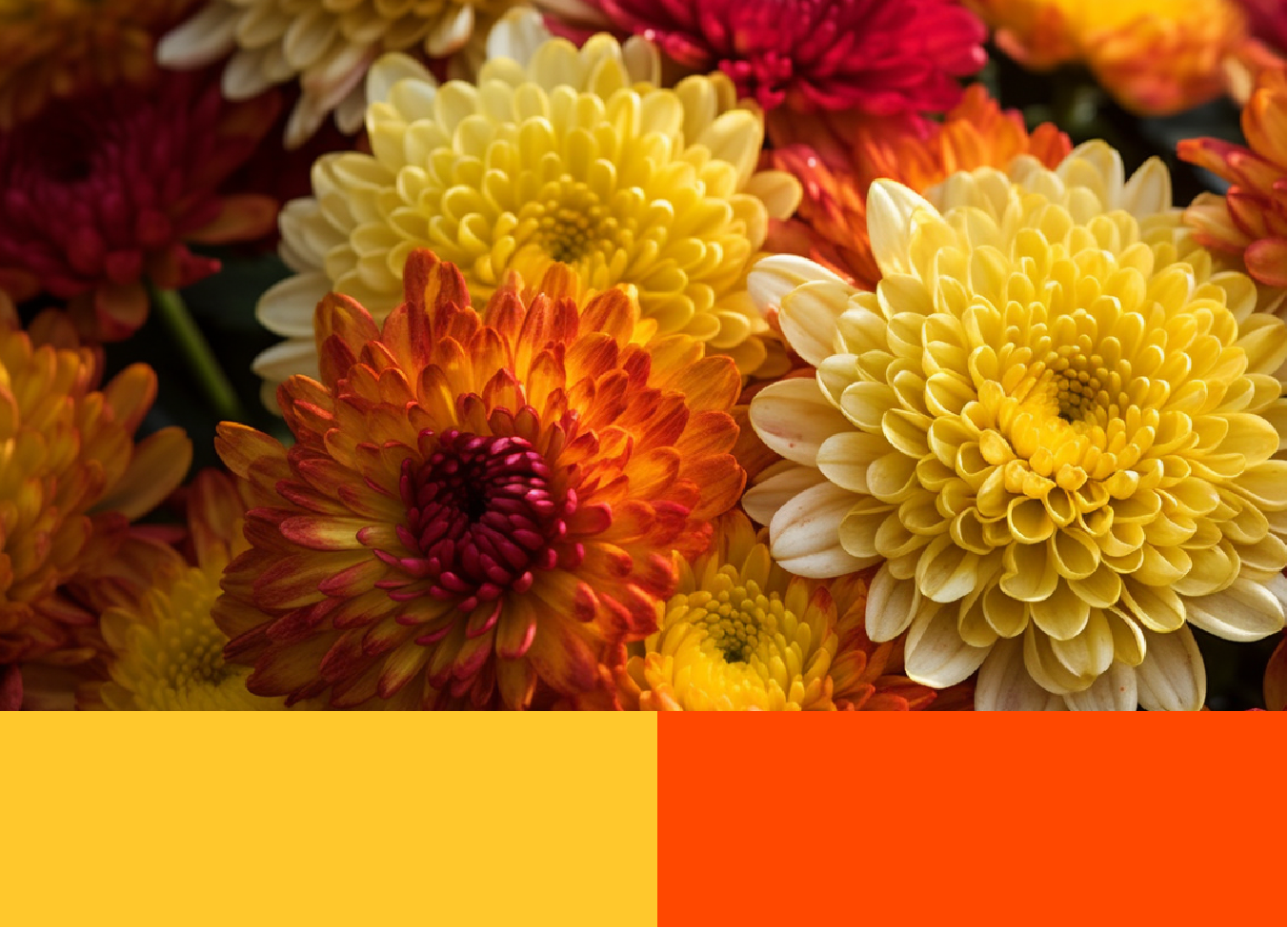
Look for colors that harmonize or contrast with the dominant colors in the picture. Harmonizing colors create a cohesive and calming effect, while contrasting colors add vibrancy and visual interest.
Example: harmony
Example: contrast
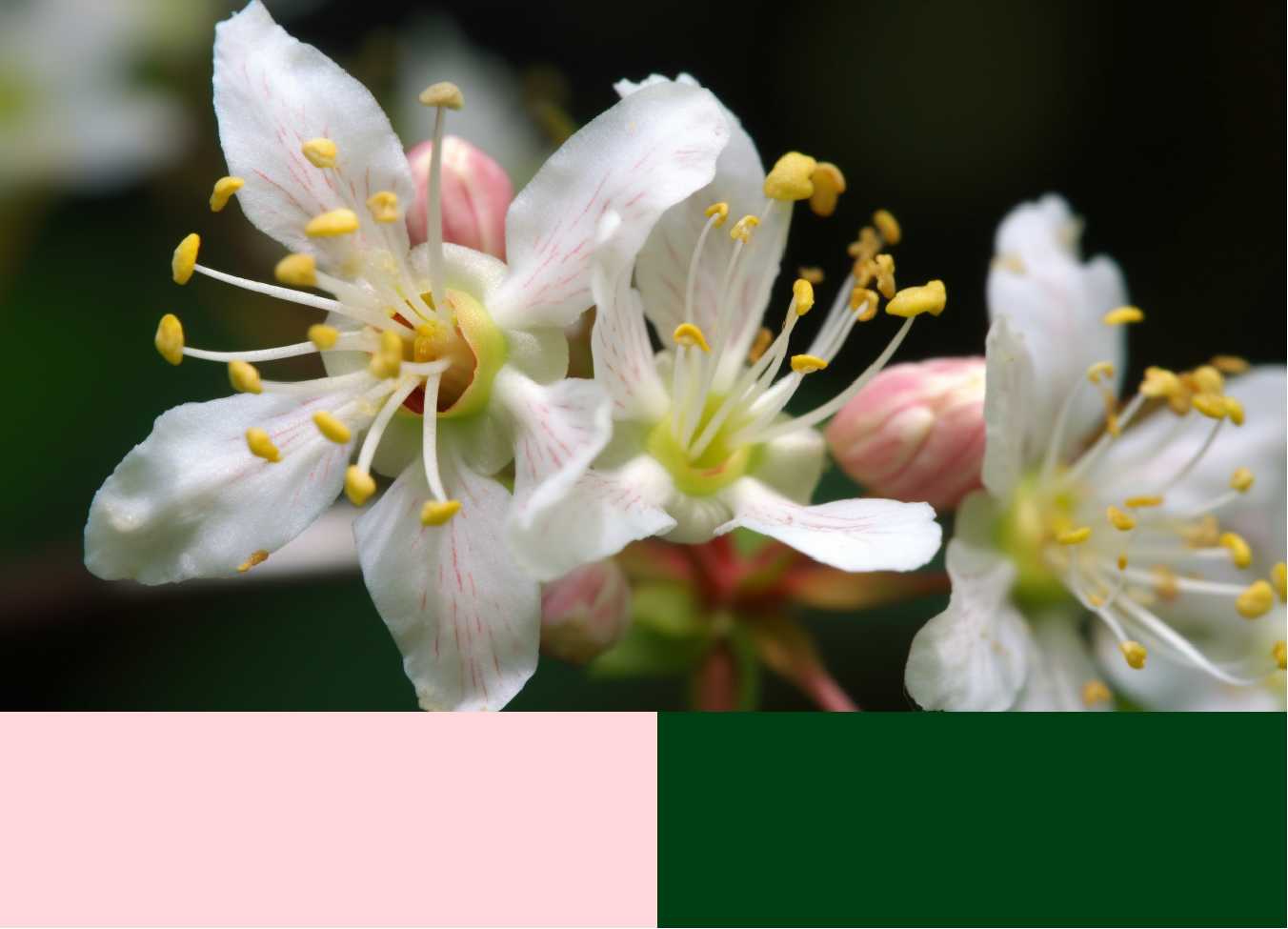 Flowers and Greenery and foliage background color.
Example: seasonal
If the flower picture represents a specific season, consider selecting a seasonal color to illustrate the vibe.
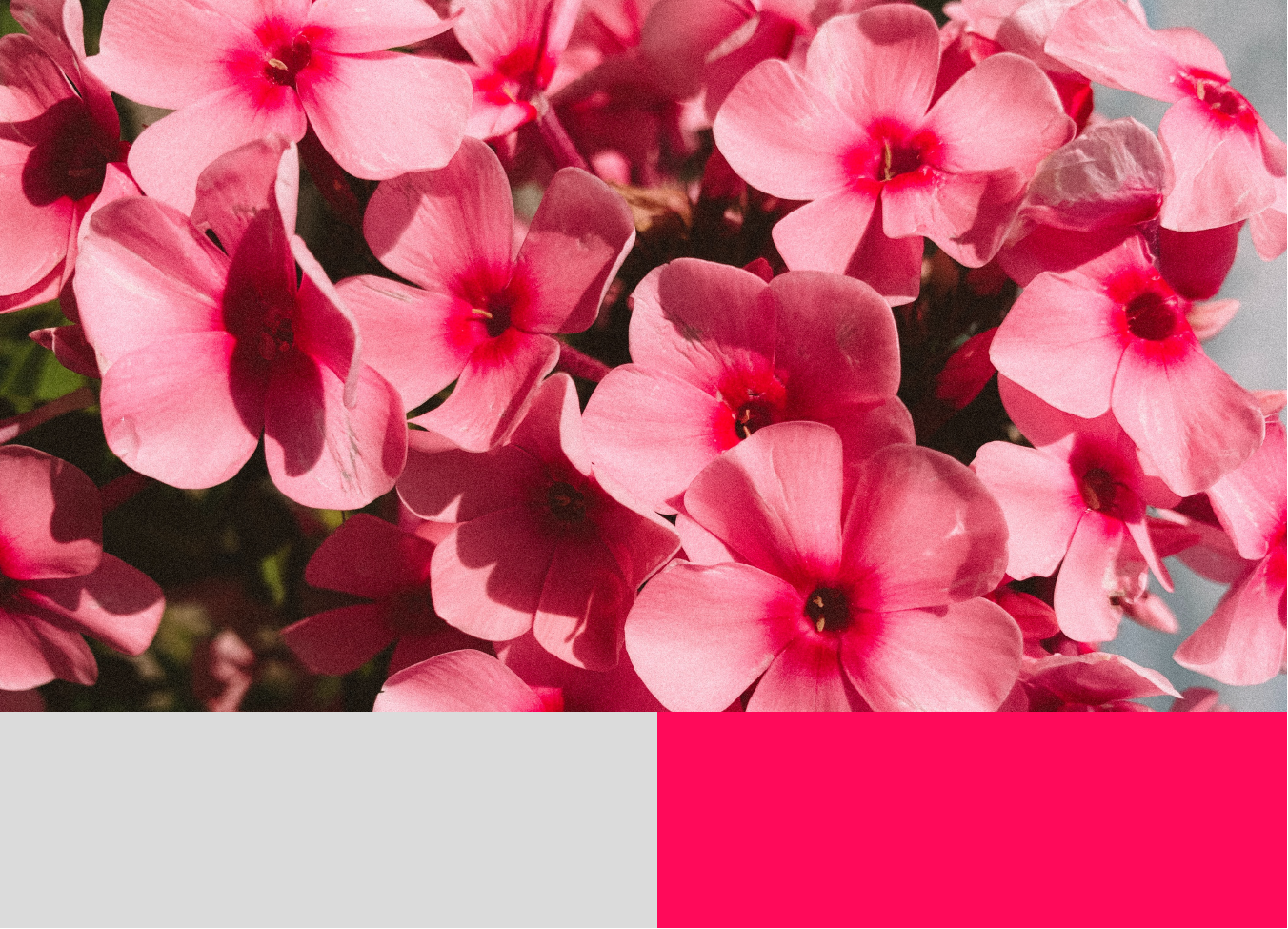 Spring
 Webshop Color
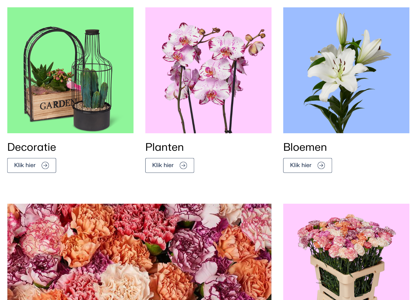
Webshop colors are provided for the webshop. This is the only place where they are allowed to be used. They serve as backgrounds for product photos. The colors are softer and contrast nicely with each other. These colors may not be used in other expressions or applied to the logo and/or illustrations.
For the webshop, the colors can be used in harmony and contrast with the products.
Lemon Yellow
Pantone: n.v.t.
CMYK:0 0 0 0
RGB:255 231 138
HEX:#ffe78a
Crystal Blue
Pantone: n.v.t.
CMYK:0 0 0 0
RGB:156 189 255
HEX:#9cbdff
Mint Blue
Pantone: n.v.t.
CMYK:0 0 0 0
RGB:147 233 244
HEX:#aee9f4
Citrus Green
Pantone: n.v.t.
CMYK:0 0 0 0
RGB:143 245 154
HEX:#8ff59a
Candy pink
Pantone: n.v.t.
CMYK:0 0 0 0
RGB:255 205 255
HEX:#ffcdff
Usage examples
How to select the right combinations
Look for colors that harmonize or contrast with the dominant colors in the picture. Harmonizing colors create a cohesive and calming effect, while contrasting colors add vibrancy and visual interest.
Example: Big blok
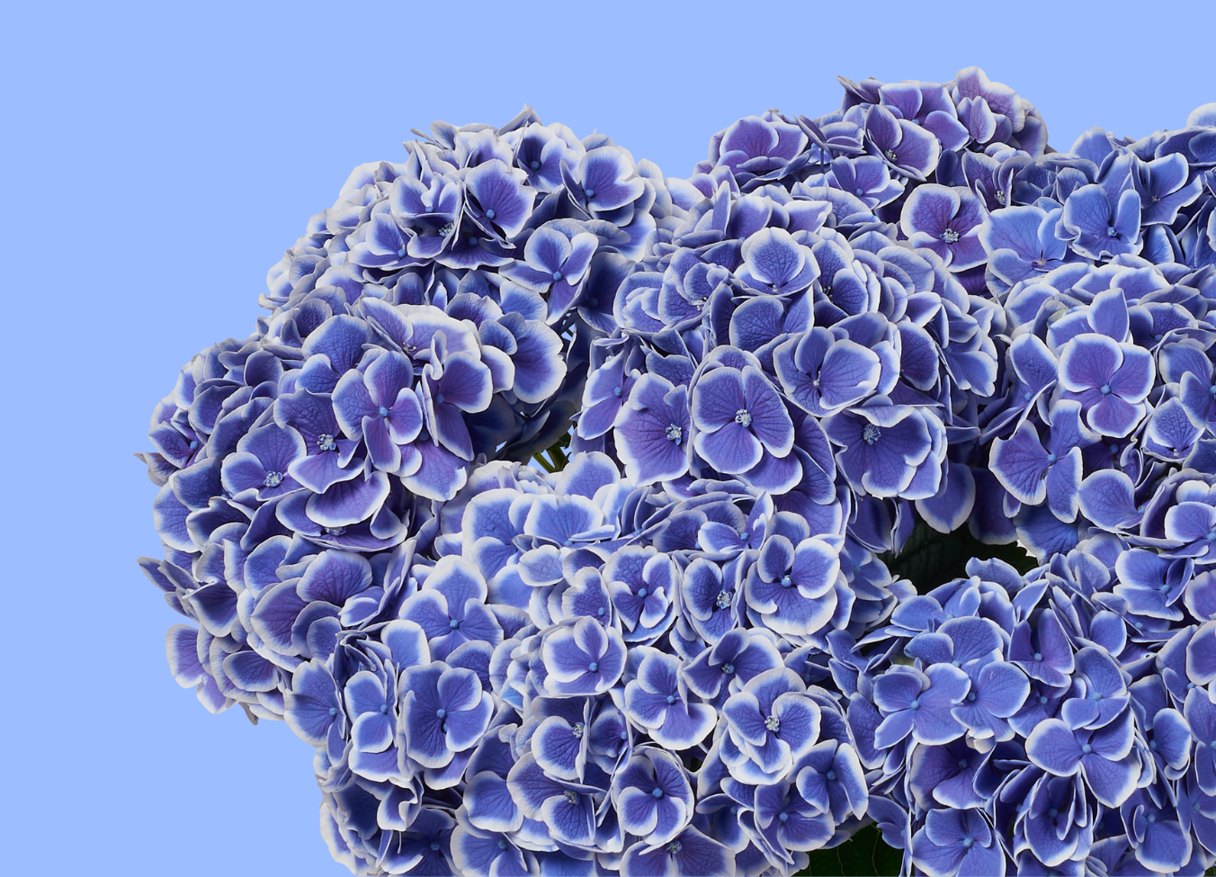
Example: webshop
You can see here how the webshop colors are applied. The colors match the products as a background. The combination of colors is beautiful and calming and fits the entire webshop.
 Spring
 Color in Illustration
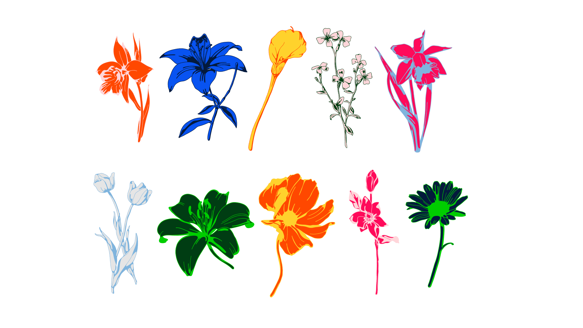
Both primary colors and secondary colors are utilized strategically in illustrations to amplify their impact. These vibrant hues add depth and dimension to our visual storytelling, infusing our illustrations with energy and personality.
Illustration with colors
Don'ts
The following examples highlight some color combinations that need to be concerned in use.
1. Dark colors on dark backgrounds
2. Bright red
3. Light colors on light backgrounds
It is not advised to combine two dark colors since they do not have enough contrast.
Vibrating colors or combinations of colors with the same intensity are unpleasant for the eyes.
It is not advised to combine two light colors since they don't have enough contrast.

4. Layout without illustration should not have more than 3 colors from the color palette
Text, logo, and logomark should be in the same color.
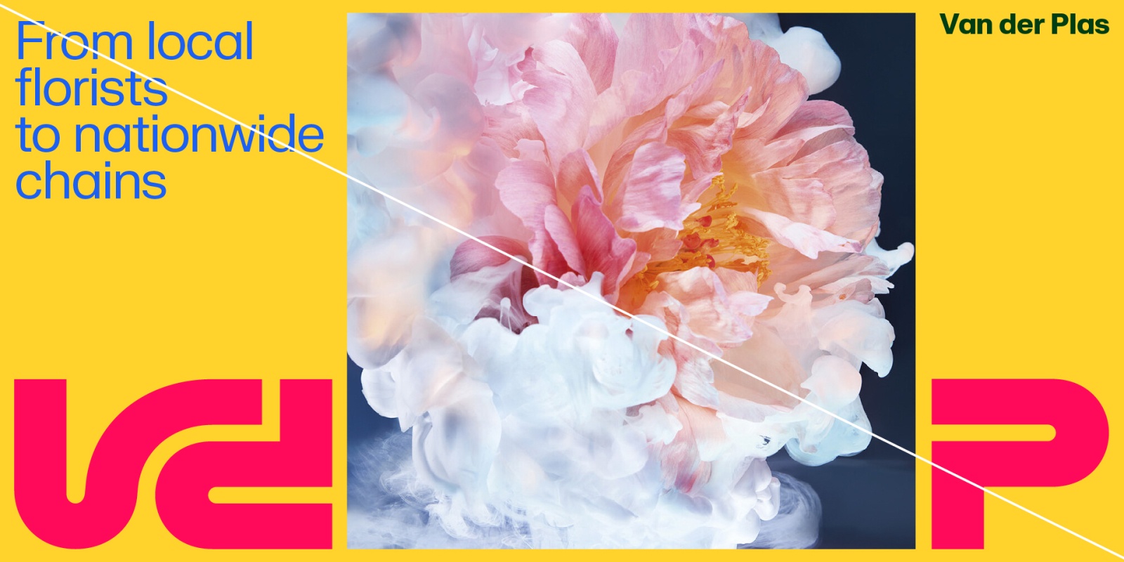
Exception case: Layout with illustration
All color on one page should not be more than 6.
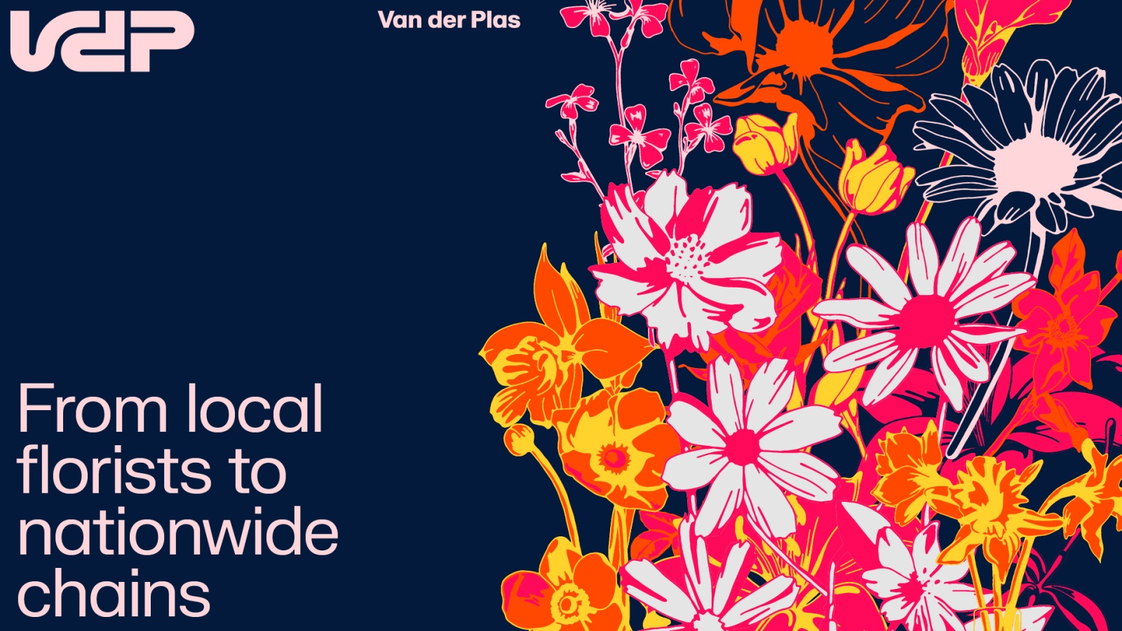
Text + Logo + Background: 2 Colors Maximum
Illustration: 4 Color Maximum
Metallic Blue usage
For printed matter, stationary, special invitations, or other celebratory moments it is optional to use an alternative for the Metallic Blue primary color. Which is a special Pantone with actual metallic ink.
Metallic Pantone
HEX:#7fb4dd
Example

