Layout system
This chapter explores the fundamental principles and guidelines for organizing and arranging brand elements in a harmonious and engaging manner. It offers grid structures and composition placement. By understanding and implementing the layout system, we ensure consistent brand communication across various mediums, enabling us to effectively convey our message.
These steps mentioned below can be used as a starting point to develop new communication items.
Page margin and basic grid
Before applying the identity on various layouts, we apply a margin to the page. The margin helps with developing the grid system for layout and the placement of the logo and style elements.
1. Page margin and margin blocks
For landscape, square, and portrait layouts, we define the margin with a predetermined number. The margin is created by dividing the length of the short side of the layout by 40.

Vertical columns
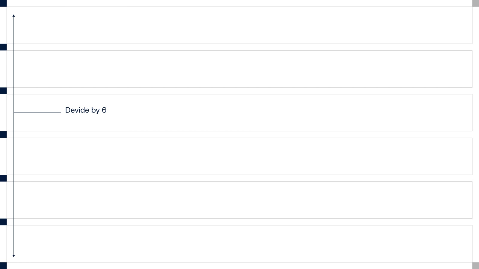
Horizontal columns

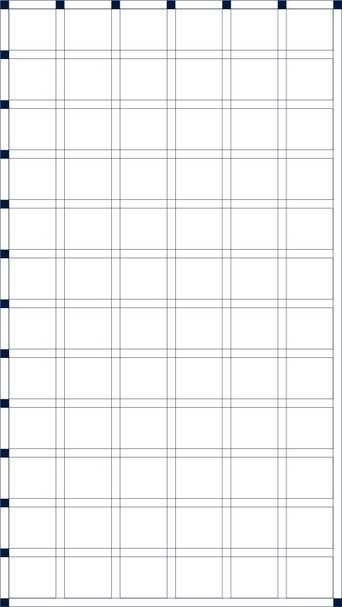
Basic grid system for layouts
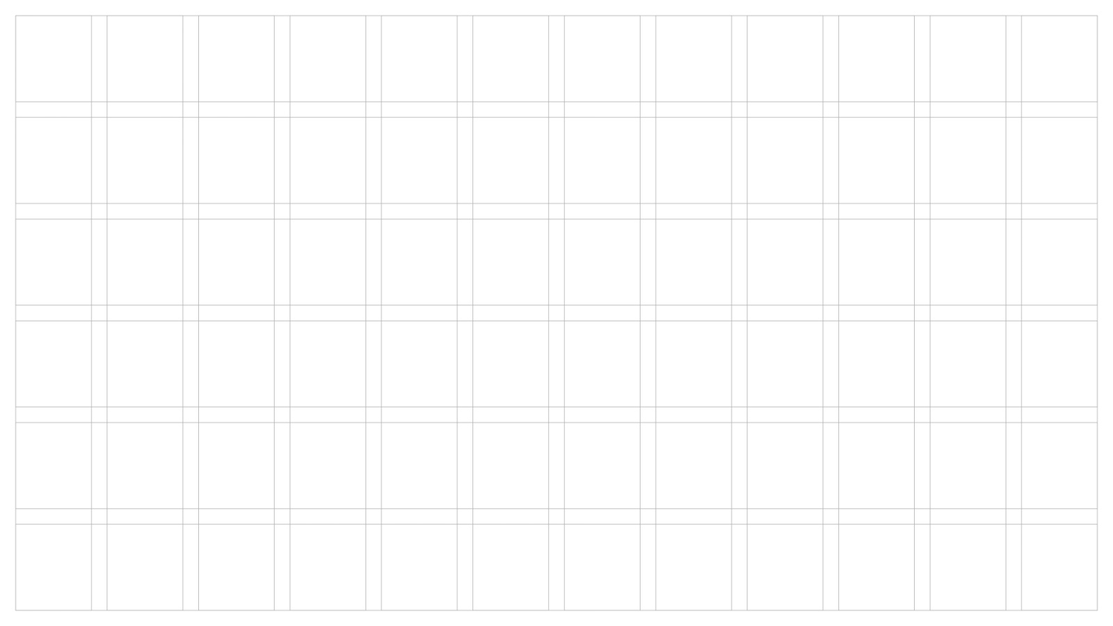
2. Placing elements in layouts
Logo
Wordmark
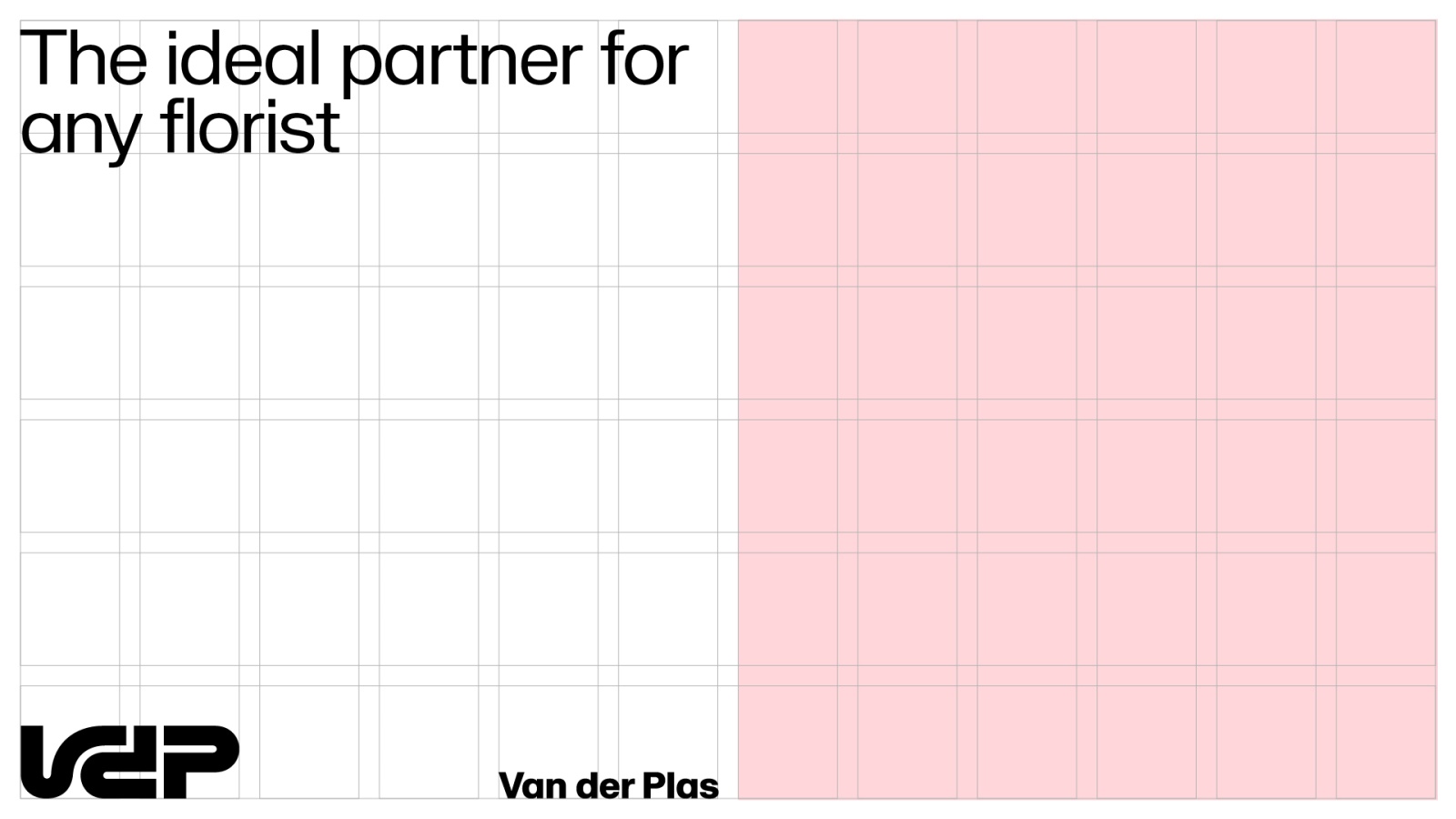
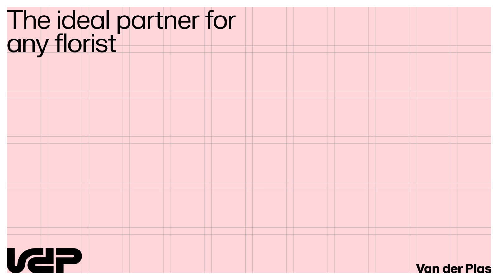
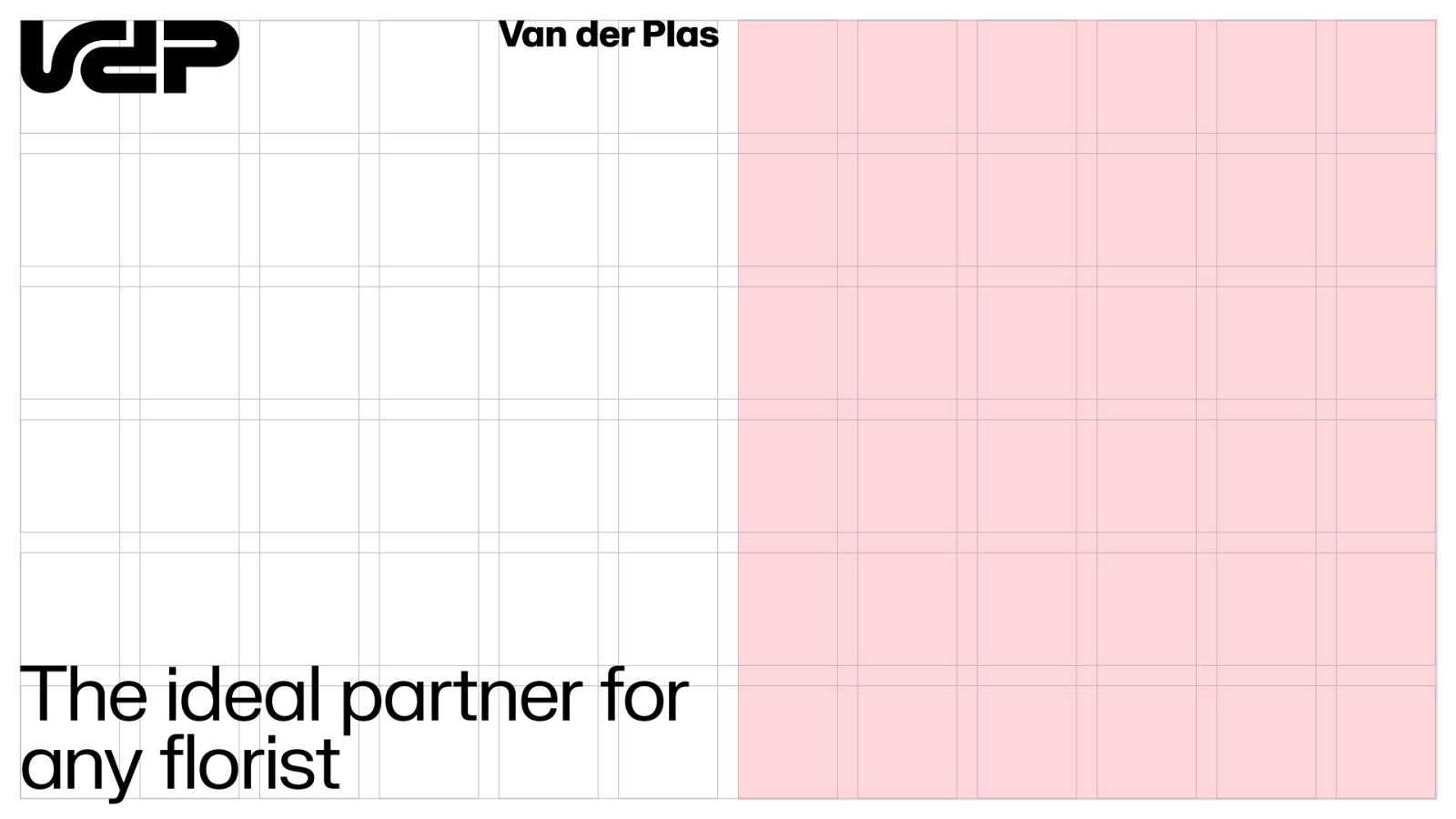
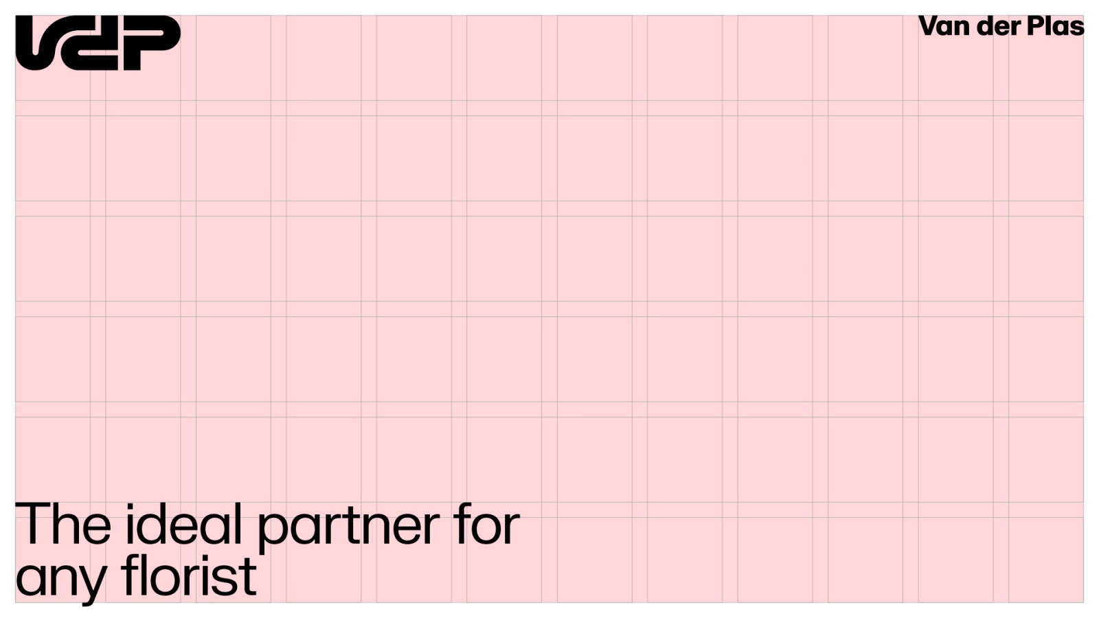
Examples


Placing elements in different layouts
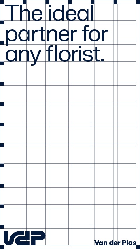
Similar steps can be applied in different layouts and create the grid for different type of communication.
Ratio: 9:16
Size: 1080 x 1920

Ratio: 4:5
Size: 1080 x 1350
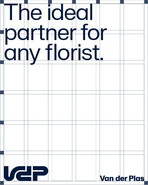
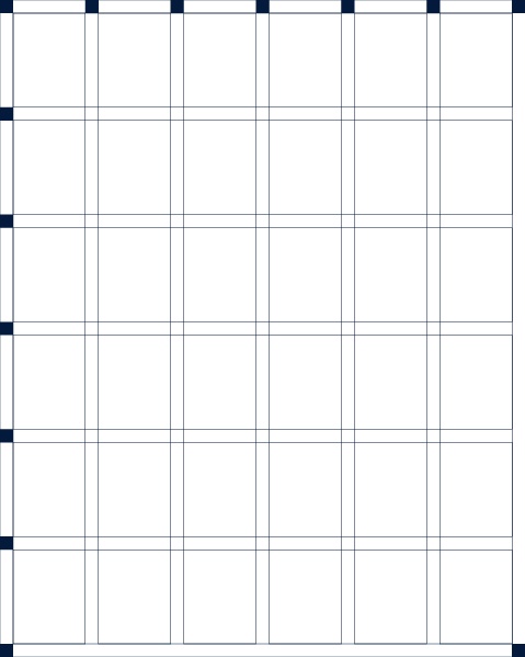

Ratio: 1.1
Size: 1080 x 1080

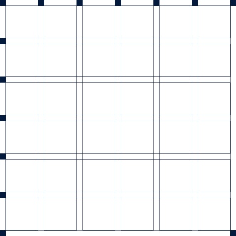

Layout varation
Based on the grid it features diverse layout variations, highlighting the adaptability and versatility of our visual identity. From minimalistic designs to dynamic arrangements, each layout captures attention and communicates our brand message effectively.
There are 2 different ways of opening up the logo and examples in landscape layouts. The steps below can be followed to create layouts with similar dimensions.
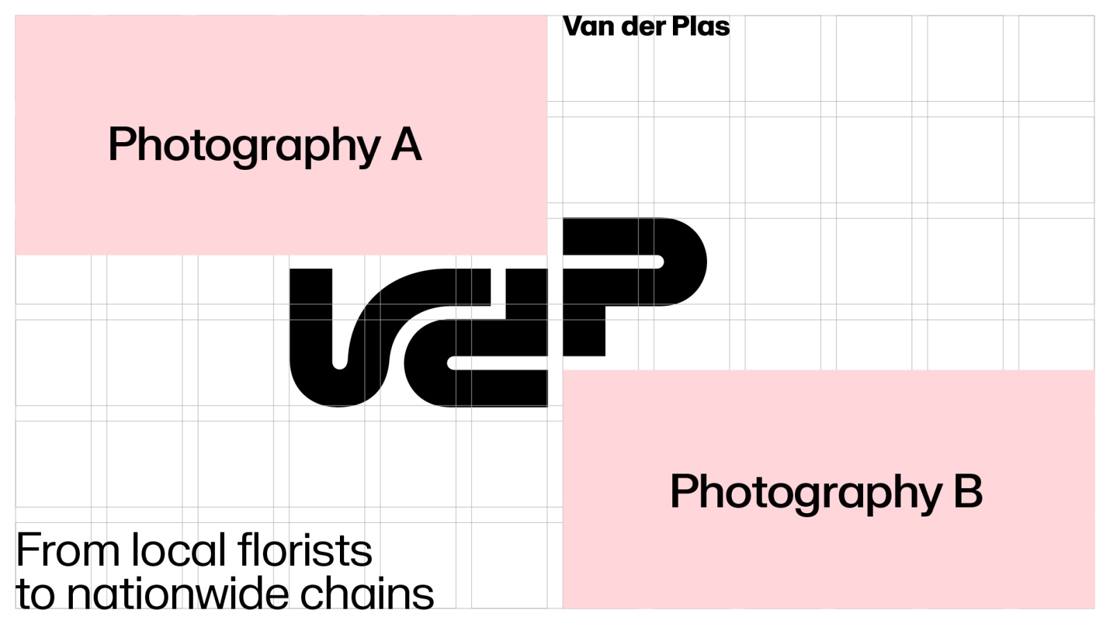
1. Layout with 2 images
We can use the letter P to move around on the grid. Opening up the possibility to play around with multiple images.
The wordmark should be aligned with the beginning of P. The full logo should occupy at least 2 columns.
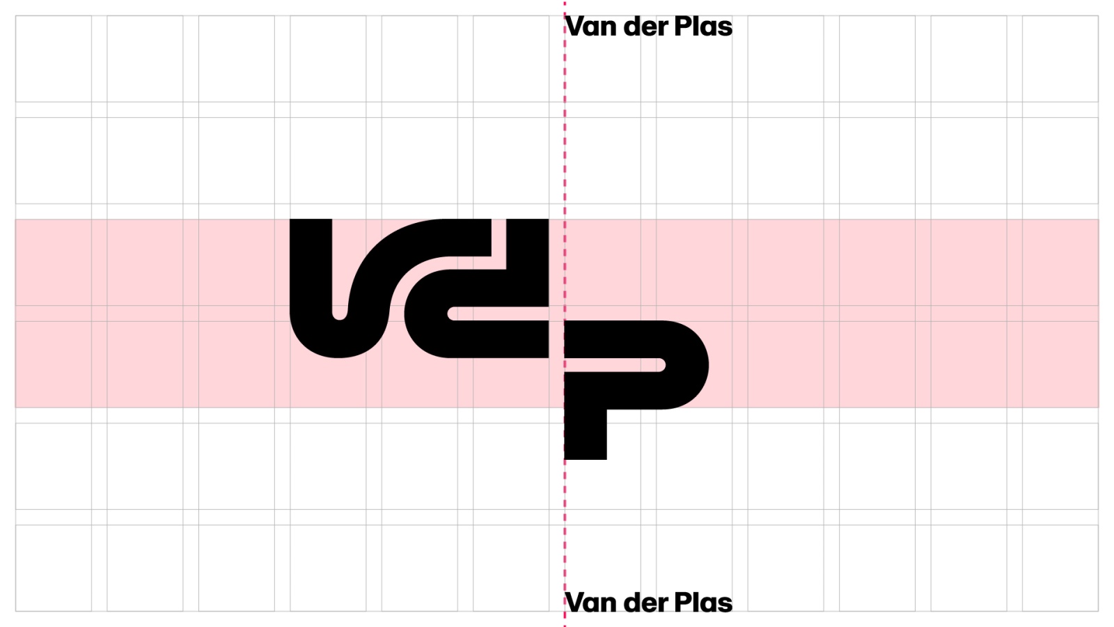
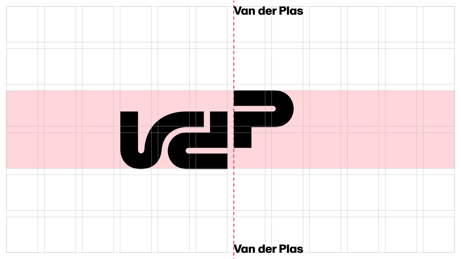
Two images can build a small story within the layouts. By strategically pairing images, you can create a visual narrative that engages the audience and enhances the brand experience in communication.
*Keep a minimum 1 margin block between content and logo

Overview

Examples


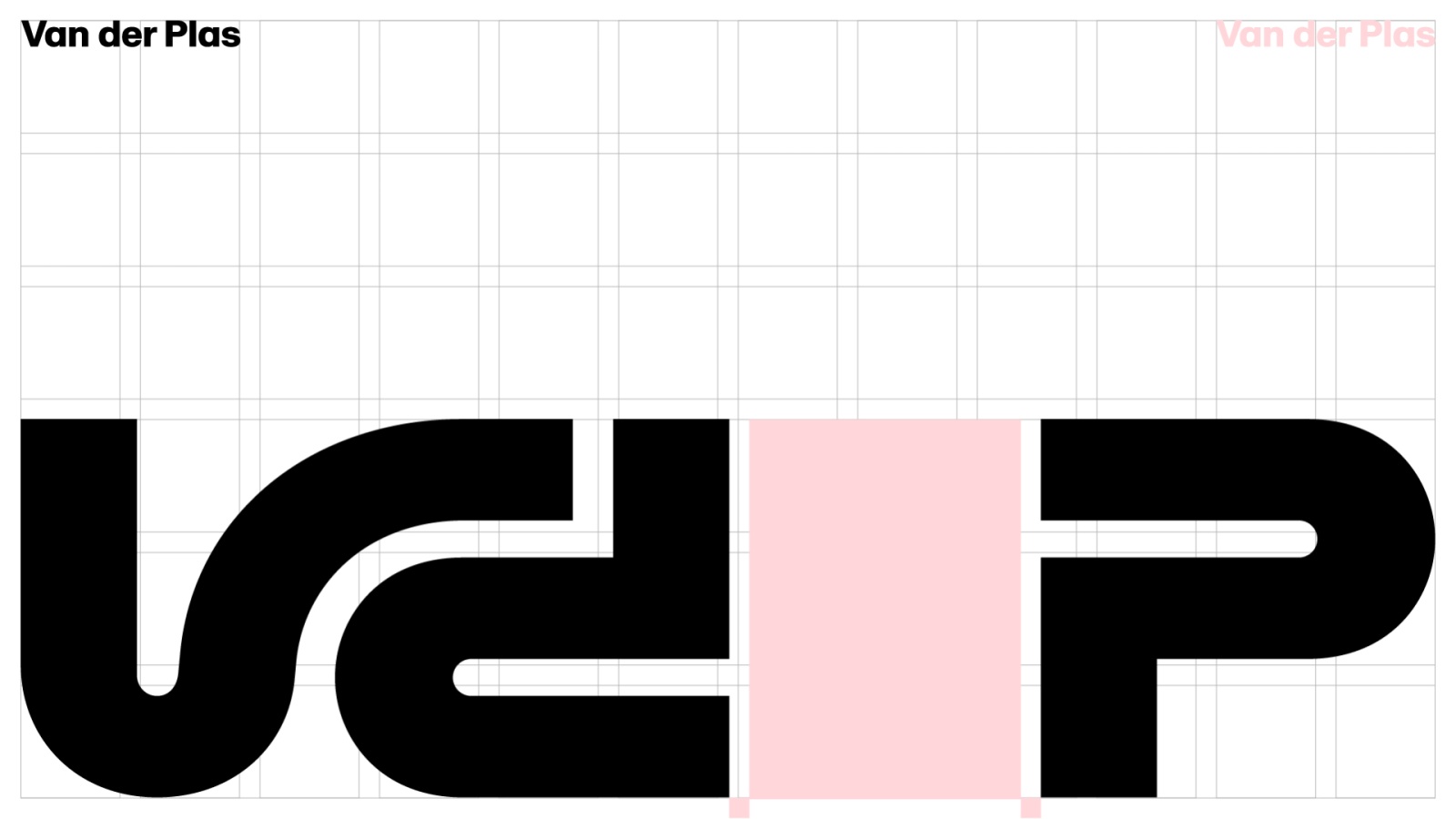
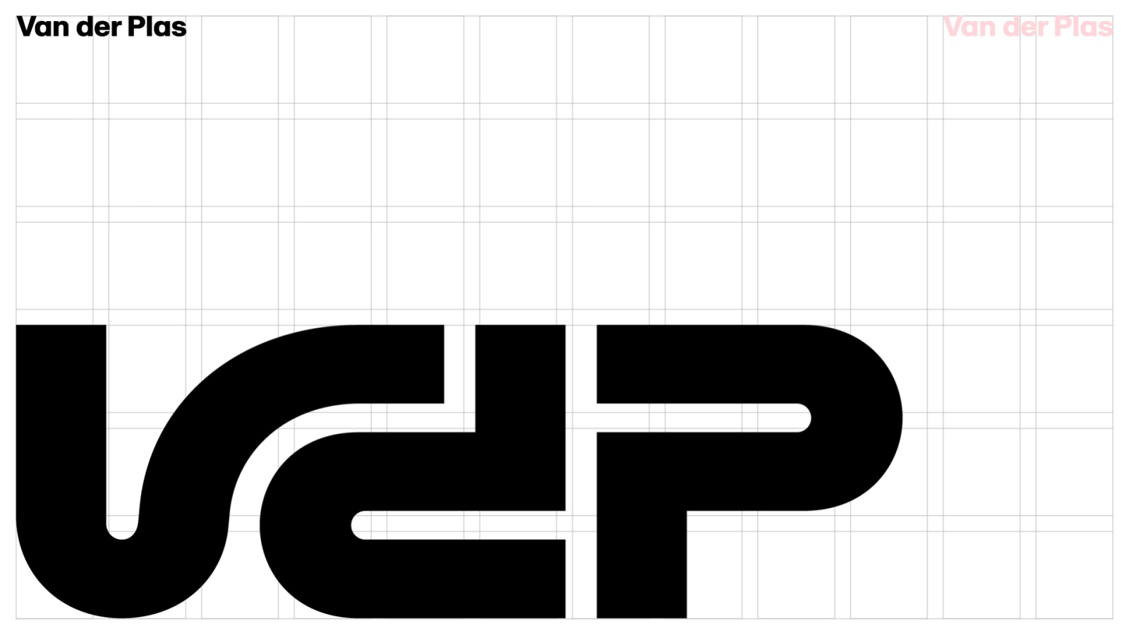
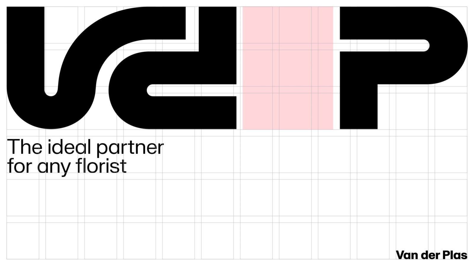
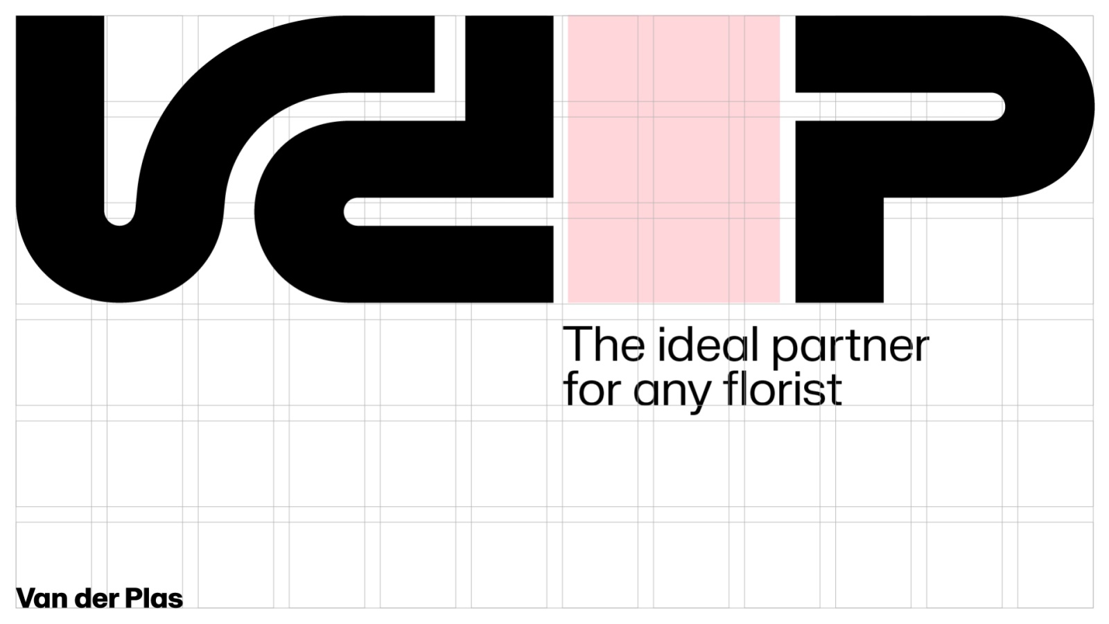
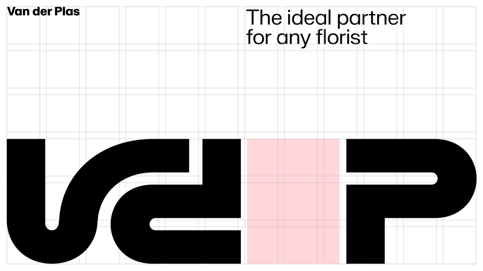
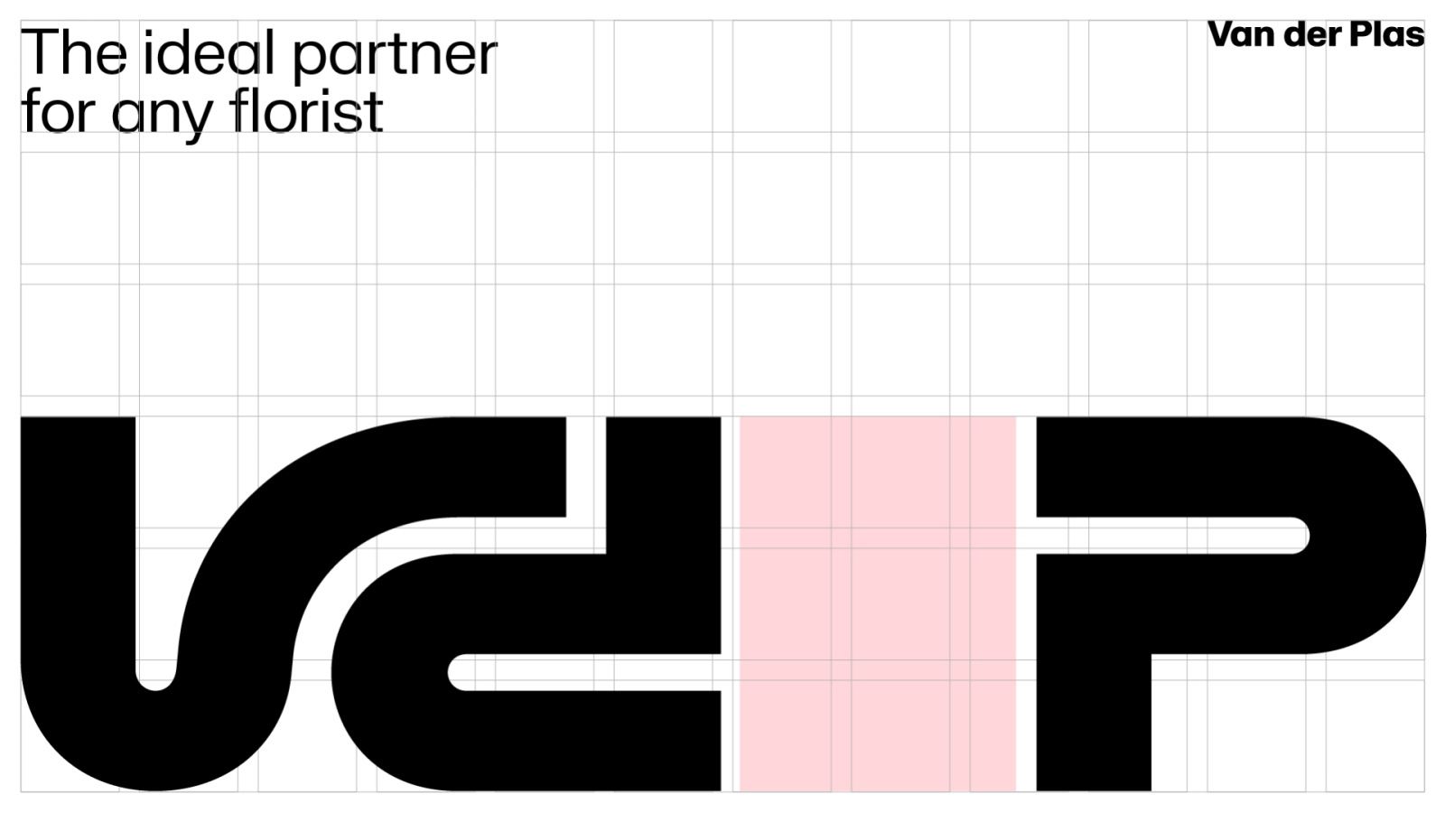
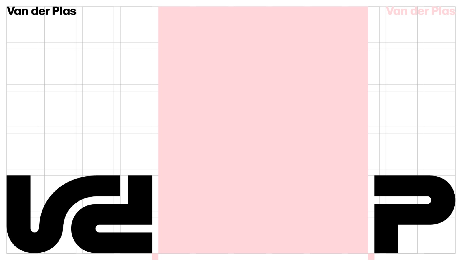
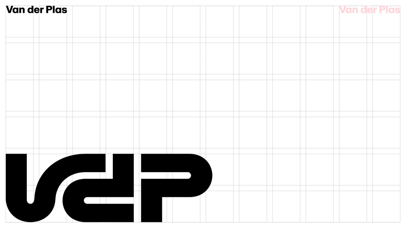
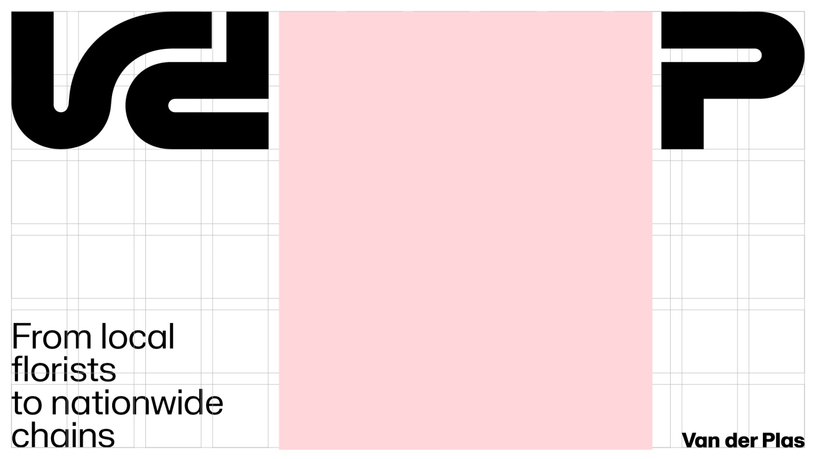
2. Layout with opening up logo
The basic logo size should occupy a maximum of 3 columns. To open up the logo, only move the P.
*Keep a minimum 1 margin block between content and logo
Examples
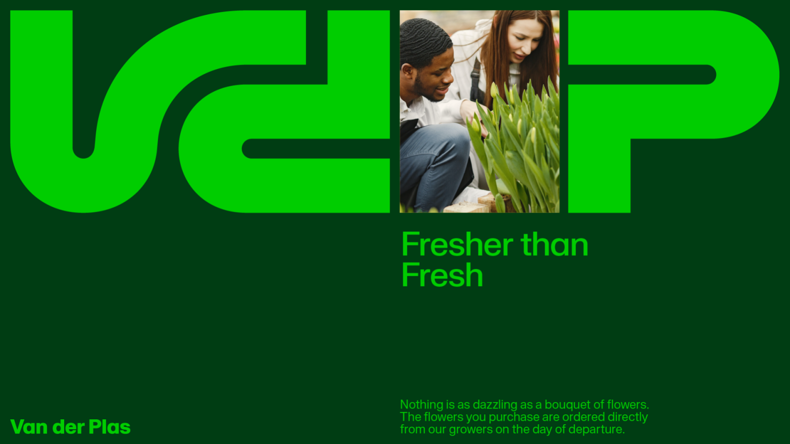

Layout with opening up logo, with larger content area
*Keep a minimum 1 margin block between content and logo
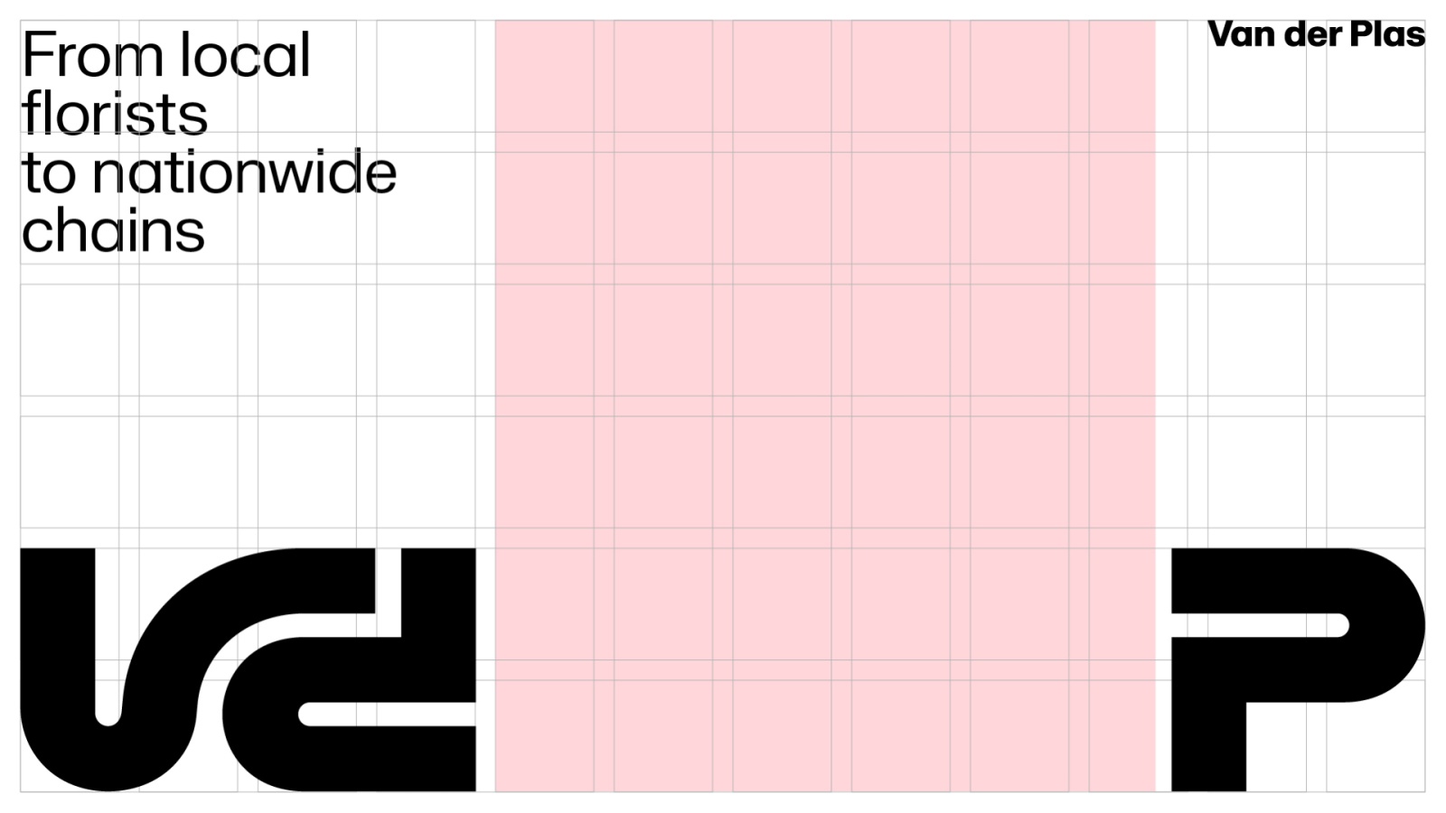
Examples


